Matthias Bressan

Skilled in data analysis, programming with Python, deep learning and statistics.
Master in Biology with experience in algae aquaculture, microbiology and bioinformatics.
Passionate about climate change and sustainability. A curious, team-oriented problem solver.
Visualising climate data
With this project we want to make complex climate data accessible to people who want to start a permaculture project. We provide intuitive graphical representations of climate informations for a location of your choosing as well as projections on the evolution of the climate in the future. In order to make the data more accessible we provide a dashboard in addition to a Jupyter notebook.
Introduction
As a biologist, a gardener and a permaculture beginner myself, I am aware of the importance of knowing the general climate tendencies of a location when planning what to plant, both for one and for multiple years. As establishing a healthy and balanced ecosystem is a longterm endavour, and climate change is a rising issue, we included climate projections for the next 30 years. Here we, a biologist and a meteorologist, teamed up to provide exactly that: a summary of the local climate, easy to understand without technical knowledge.
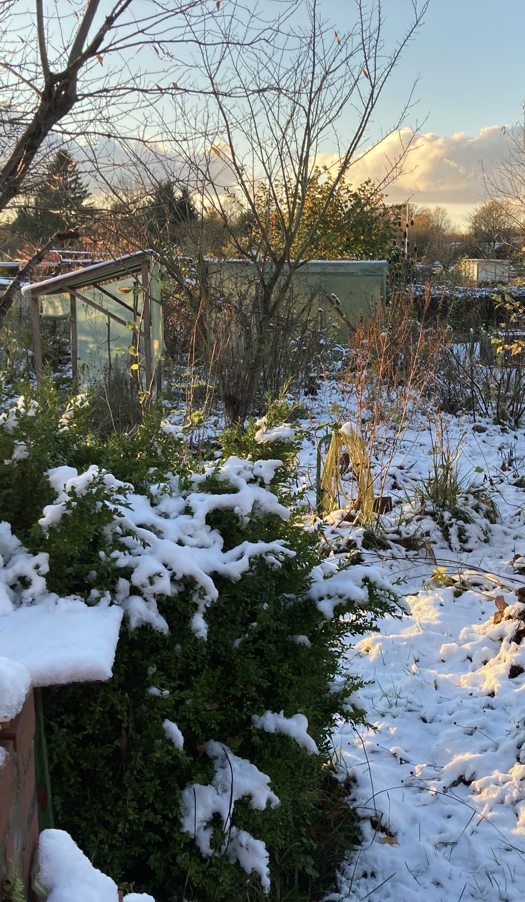
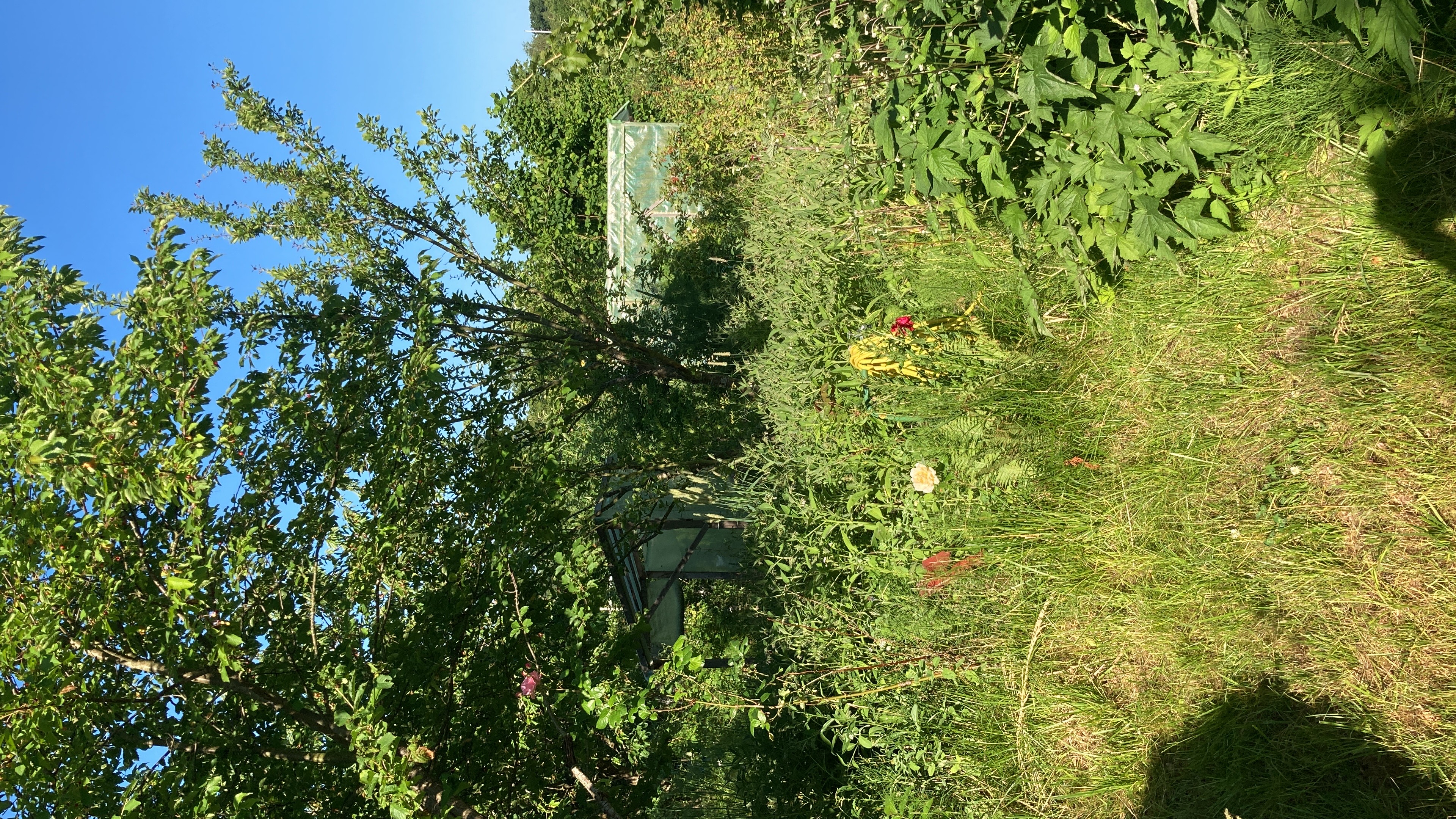
The pictures above are showing my own garden. What looks like chaos on the right is a selected mix of local plant species that provide a good and healthy habitat to insects, birds, small mammals and amphibians.
What we learned/improved
- Create an app with a database using Dash, Plotly and SQL
- Manage netcdf and grib files (Xarray and Pandas)
- Write API requests
- Recognize bottlenecks and optimizig performance
- Project management with GitHub, code organization for better readability
Datasets
The dataset used for the past climate data is the ERA5 monthly averaged data on single levels from 1940 to present. This dataset provides data on a number of different variables from 1940 to the present, offering a resolution of 0.25 degrees. Of all variables available we picked rainfall, temperature, humidity, wind direction and wind speed as well as total cloud cover, as we think they are the more important when it comes to starting a permaculture project. As we take a box of 2x2 ° (roughly 250x250 km) around the selected location, the graphs we provide will give you an idea of the general climate in your region.
For the projection data we opted for the CMIP6 climate projections dataset coming from CDS. This dataset assumes a rise in temperature of 4.5 °C, as well as a shared socioeconomic pathway index of 2. We chose those two options as they offer a scenario with intermediate challenges and are the middle pathway of all available scenarios.
For more information on the dataset and the criteria of the scenarios we recommend the paper: The Scenario Model Intercomparison Project (ScenarioMIP)
for CMIP6.
From this dataset we took projected rainfall, temperature, wind speed and wind direction.
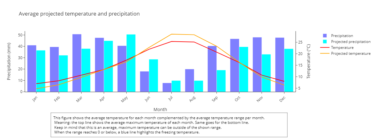
Graphical representation of the data
Here we want to show one of our graphs as an example. This particular graph is made for Puebla de don Fadrique, Spain, as there is a starting permaculture project we provide the data for.
Dashboard creation
We decided to create two versions of this program in order to augment its user friendliness. One is a Jupyter notebook where the code is executed cellwise, while the other is a dashboard. The idea behind the dashobard is that once all dependencies are installed, the climate informations are accessible to anyone, regardless of their python knowledge. The design is kept as minimalistic as possible. After entering a location the graphs are calculated and plotted, along with a description of the graph and a small introductory text for the selected location. While the accessibility problem was solved creating a dashboard, it left the challenge of long loading times.
Database management and performance optimization
In order to decrease loading times we implemented two things:
first we downloaded a dataset that includes all of mainland Europe as the standard CDS API can be quite slow. This means that only one time consuming API request is needed to get the required data before using the dashboard for the first time.
At the same time this means also that the already slow process of loading the grib files becomes even more tedious. We approached this by moving the variables from grib files (for the past data) and nc files (for the prediction data) into a .db file, accessible using SQL queries, which substantially reduced loading times.
Another step we took to achieve better performance is the parallelization of the climatology calculations using dask.
Future steps and expansion
While our dashboard runs locally, we developed it in a way that it can be deployed online without much extra effort.
We would also like to include biological information specifically centred around permaculture. Meaning, in addition to the climate data provided here, the user gets a list of plants that grow in the selected area, and ideally also informations on growth temperature, water needs, and so on. This was not realisable yet as this information is not accessible for plant species that are outside of the main agricultural focus, but are really important for a local ecosystem and therefore permaculture.